Forecasts for 2022 reveal that end-user cloud spending might reach $5.7B this year alone, by 2027 it should reach an estimated $9.8B
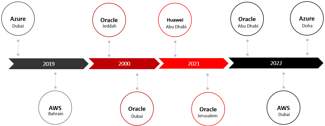
In the last four years, companies such as Amazon, Microsoft, Oracle and Huawei have launched 9 cloud regions
Those new data centres enable low latency access to the hosted applications and content and help prevent data packet trips to Europe
Rapid cloud adoption by businesses and governments in the Middle East region is fuelling the expansion of new cloud regions. Forecasts for 2022 reveal that end-user cloud spending might reach $5.7B this year alone. In the last three years, companies such as Amazon, Microsoft, Oracle and others have launched multiple new data centres. Those new data centres enable low latency access to the hosted applications and content and help prevent data packet trips to Europe. This blog will uncover which cloud vendors are doing well in reducing the latency for the end users in this region and which still have the opportunities to improve their interconnection partnerships.
Cloud region launches
Since 2019 there have been 9 cloud region launches in the Middle East by AWS, Azure, Huawei and Oracle.
How SpeedChecker measures cloud latency
We leverage our expertise and existing testing solution in crowdsourcing quality of service for measuring cloud
End-to-end latency measurements from real users to the cloud
Tens of thousands of devices in the Middle East contributed to the measurements in this study
SpeedChecker deploys its measurement servers in each cloud region and instructs client test devices to test all cloud regions in sequence
The importance of local cloud regions
The interconnections between various networks in the Middle East are not sufficient
One cloud region cannot serve all countries in the region
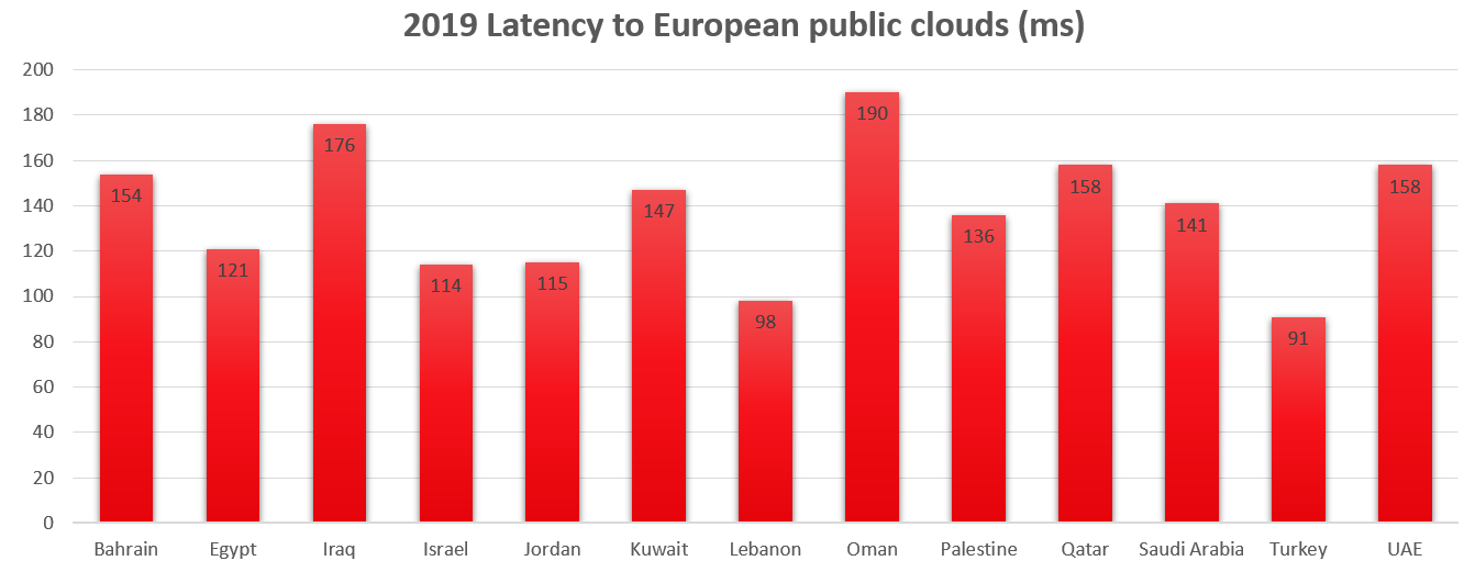
Prior to 2019 applications and data hosted in European cloud servers resulted in latencies of >100ms
Latencies >100ms are unacceptable for many uses, especially for gaming
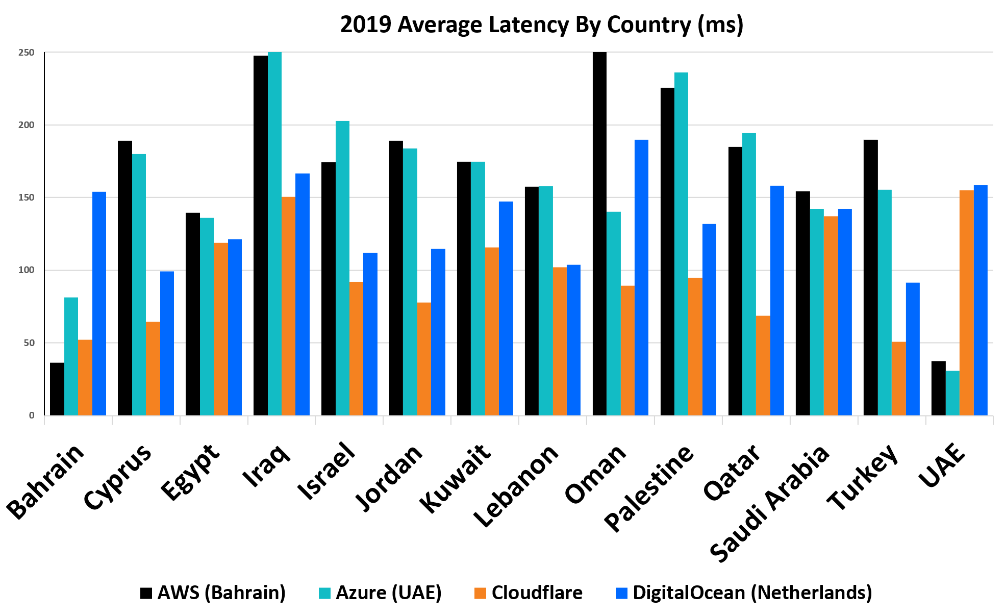
After UAE and Bahrain cloud regions launched (2019)
While UAE and Bahrain benefit from a substantial reduction in latency after the launch of cloud regions in 2019, other countries in the region see their latencies increase. Oman is the only exception.
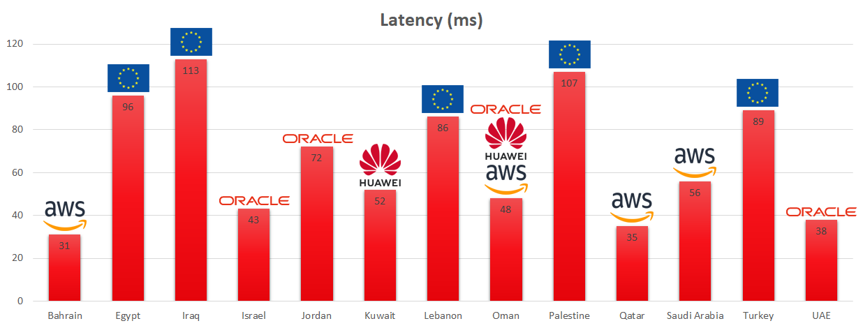
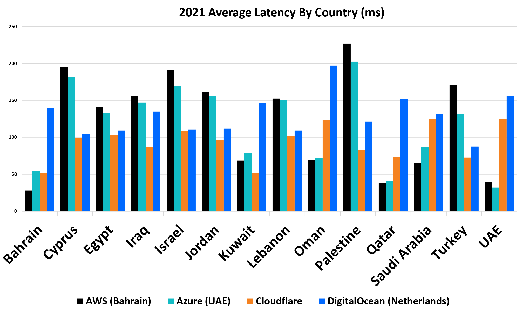
The current situation (2022)
As more cloud regions were launched the latency for all countries has improved considerably with many countries enjoying latencies of less than half their previous values. Only Iraq and Palestine exceed 100ms.
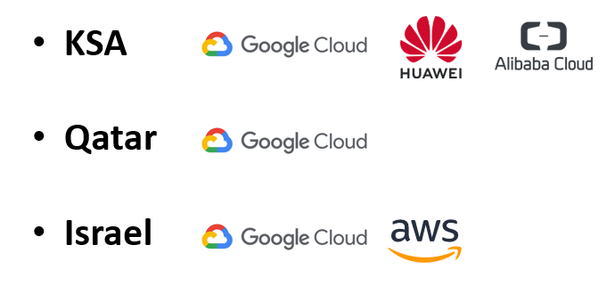
The future – New cloud regions being built
Further improvements are expected as Google, Huawei and Alibaba launch in Saudi Arabia, Qatar and Israel.
SpeedChecker, a crowdsourcing company, has announced the results of its 2021 awards on mobile network speeds and coverage in Africa. The awards are given to countries and mobile operators in 2 categories : Fastest mobile network champion and Best mobile coverage champion.
Unlike other comparisons and studies done before this one is based on the data points collected from millions of mobile devices in Africa. This means data is not skewed or biased towards some operators or regions and provides a true picture of how the mobile networks are performing on this continent.
The best countries with fastest Internet are not surprisingly Morocco at #1 and South Africa at #2, followed by Tunisia at #3. More surprisingly is Mali at spot #4 as this land-locked relatively poor country has beaten bigger and more developed countries on this metric.
The 2nd category of the best mobile coverage on the continent has island countries with beautiful Mauritius winning the Best mobile coverage champion award, followed by islands of Comoros and Seychelles. From the continental Africa the top spot is taken by Egypt followed by South Africa and Kenya.
For full details of winners and rankings, please download the file below.
In recent years crowdsourcing has become a popular method to evaluate quality of service of telecommunication networks. In May 2020 recommendation E.812 : Crowdsourcing approach for the assessment of end-to-end quality of service in fixed and mobile broadband networks, has been approved in ITU Study Group 12.
Crowdsourced data has following advantages over traditional probe-based data collection systems:
Crowdsourced data contain large amount of geographically diverse measurements
Since the measurements are collected from end user mobile devices, geographic distribution of the measurements follows the population density
They are more representative of the actual user experience
They not only support active measurements but also can monitor passively the network utilization from the mobile device during the time the users perform their normal activities
They reveal additional information such as handset usage
For the purpose of disaster mapping their additional benefits such as:
Device GPS sensor can provide accurate position of the measurements
Large amount of data samples can provide better view of the size of the impact area
Measurements can be scheduled remotely without the need to place the probes in advance
More information can be found in E.812.
In 2020 ITU and SpeedChecker started evaluating a concept of using crowdsourced QoS measurements for disaster connectivity mapping. A prototype Disaster Connectivity Map (DCM) was built and tested on an ITU server, which takes measurement data provided by SpeedChecker.
Data collection methodology
Data is collected from end user devices running Android and iOS systems. SpeedChecker partners with 3rd party app publishers which have popular apps in the stores. SpeedChecker offers a mobile SDK (https://github.com/speedchecker/speedchecker-sdk-android) that can be integrated into 3rd party apps. End users opt-in to providing accurate location to SpeedChecker. SpeedChecker anonymizes the results and all reports are built on aggregated data which does not reveal user identity or compromises user’s privacy.
All measurements are executed towards a CDN which has a large geographical footprint and hosts a significant part of the content that is being accessed by the users. This ensures the results are a good approximation of the user’s actual quality of experience. All measurements must contain accurate location information using GPS or wi-fi geolocation method. Measurements are considered only from the apps that have been approved by SpeedChecker. Submitted measurements are checked if they are within expected ranges and additional security precautions are implemented to ensure measurement data is not being manipulated.
Diagram of the SpeedChecker crowdsourcing system
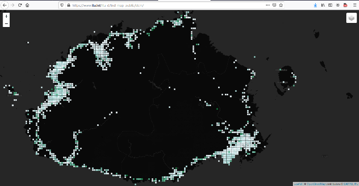
Baseline measurements show connectivity performance map
Fiji SpeedChecker data, point grid @ 1 sq.km.Fiji SpeedChecker data, point grid @ 100 sq.m.Fiji SpeedChecker data, point grid @ 10 sq.m.Fiji SpeedChecker data, point grid @ 10 sq.m. zoomed inFiji SpeedChecker data, point grid @ 10 sq.m.
During 2020 a series of measurement campaigns were executed by SpeedChecker which were used to produce baseline maps in the DCM which show connectivity performance in selected countries under the normal (baseline) situation without any disaster event happening.
SpeedChecker delivered approx 30,000 measurements in the period of 7 – 14 May 2020 for three pilot countries of Dominica (3,805 points), Fiji (11,775 points), and the Philippines (15,406 points). Each measurement consisted of ping (Ms) + download speed (Kbps) + upload speed (Kbps), Latitude, Longitude, Country, City, Connection, Platform, Network, and IP Address.
The results showed a good spatial distribution of datapoints within these countries, in line with population density. In the prototype DCM the measurements are then processed in an SQL database to be aggregated by space and time, before they are plotted as a point grid on the map.
These maps to the right show the point grid produced for Fiji, with individual datapoints aggregated into grid cells at a resolution of 1 sq.km increasing to 100 sq.m and 10 sq.m to show more granularity as the map is progressively zoomed in to the capital city of Suva. This method also further anonymises the spatial location of individual users providing input measurement data.
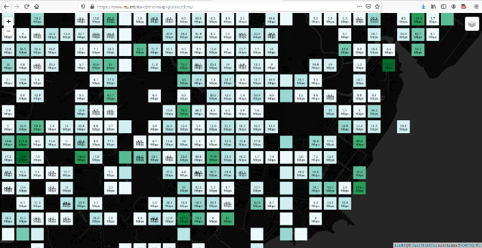
From this measurement data a bandwidth surface can also be generated for each measurement type (ping, download speed, upload speed) by interpolating these known points to estimate performance in all those other places without measurement values.
This bandwidth surface can be displayed as a heatmap, raster, or as bandwidth isolines (or “contours”). Dynamic bandwidth contours can be produced in near real-time because as the underlying data points change, the map changes automatically as map is rendered on-the-fly.
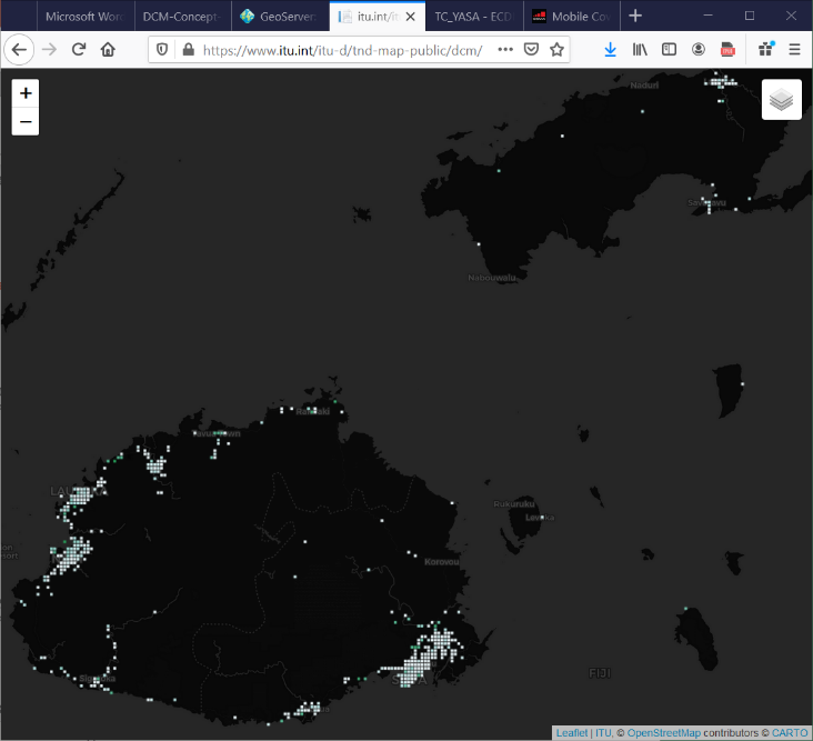
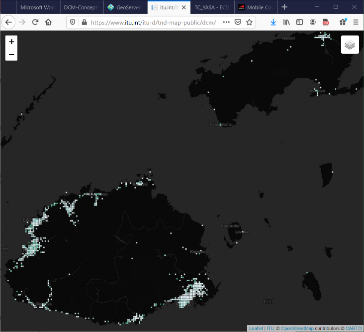
Real time measurements detect network outages during disaster events
Fiji baseline, May 2020 (11,775 datapoints)Fiji, 17 Dec 2020 (4,101 datapoints)Fiji, 18 Dec 2020 (7,919 datapoints)
The prototype Disaster Connectivity Map was tested in a real time disaster situation during December 2020, when category 5 tropical cyclone Yasa hit Fiji from 16 – 18 December 2020. The 11,775 measurements taken in May 2020 provided a reliable baseline to show where and what was the level of connectivity across Fiji under normal circumstances.
At the request of ITU, SpeedChecker started a new measurement campaign on 16 December which lasted for five days and delivered 68,207 measurements in the period of 17 – 21st December. Tropical storm Yasa made landfall on island of Vanua Levu in the early morning of 17 December, with high winds and flooding causing significant damage and network outages along the path of the storm across the islands of Fiji.
The maps from the DCM prototype to the right show a clear pattern in which connectivity is reduced across most of Fiji on 17 December, and then gradually returns over the course of the next three to five days but that there are some places in Vanua Levu and other islands where persistent connectivity gaps and network outages remain.
The number of measurements obtained over the five day period is also telling compared with the baseline of 11,775 results obtained in May 2020. A total of 4,101 results were obtained in the 24 hours until 17 December (approx one third of the baseline), which increased to 7,919 results on 18 December (approx two thirds), and had returned to the normal level of 12,442 results on 19 December.
Of the total of 68,207 measurements taken during this period, seventy percent (47,646) were obtained from mobile devices connected to cellular networks. By comparing the location of these datapoints against cell towers it was possible to determine which individual cells had been either ‘seen’ or ‘not seen’ during the period. Cellular network coverage was filtered on this basis, to show which cells sites were not seen.
SpeedChecker shares their insights on how the new AWS and Azure data centers in the Middle East have contributed to reducing latency and improving the user experience.
In recent years it’s without question that operators in the region are improving the user experience considerably. 5G dominates the industry, focusing both on the investment front as well as on the marketing push. A less sexy topic to boast about is the continuous drive to improve the interconnections which play a major role in improving the user experience as well. Operators, when launching 5G, often accompany marketing messages with speed test app screenshots showcasing 1Gb+ speeds. This indicates the challenge in the industry to find the real use cases for 5G as, surely, the purpose of 5G is not just making speed tests faster.
At SpeedChecker we look beyond measuring fastest 5G speeds: our testing methodologies look at capturing data on the user experience such as video streaming, web browsing or services relying on low latency. One of the topics that we feel does not get enough attention from the industry is the impact of new data centers in the region and how they improve the latencies and, in effect, user experience of many services which are hosted in the region and are latency sensitive.
First Microsoft Azure and then, soon after, Amazon AWS launched new data centres in the Middle East. Azure launched in the United Arab Emirates in June 2019 and AWS launched in Bahrain in July 2019.
Shortly after the launch SpeedChecker evaluated the connections to the new data centers from the Middle East region. The results were not pretty: most of the connections to both Azure in UAE and AWS in Bahrain were not providing low latency links that would improve the quality of experience. With the exception of Bahrain and UAE which interconnected very well, the rest of the countries had latencies to the new datacenters in the Middle East that were similar to those in Europe. This meant that to truly offer great user experience across the region CDNs such as Cloudflare had to be utilized.
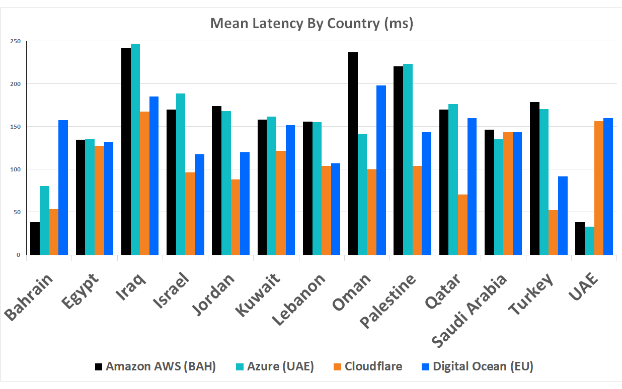
Chart 1: Average latency to AWS Bahrain, Azure UAE, Cloudflare and DigitalOcean Amsterdam in 2019
Fortunately, since 2019 the situation has improved considerably for both AWS and Azure clouds.
Chart 2: Average latency to AWS Bahrain, Azure UAE, Cloudflare and DigitalOcean Amsterdam in 2021
The biggest improvements were experienced for users in Qatar, Kuwait, Oman and Saudi Arabia. The latencies to the new datacenters in UAE and Bahrain from those countries decreased by more than 100%.
Not all users in those countries benefited equally though. Some operators invested heavily in improving the latencies, most notably Ooredoo (in Qatar, Kuwait and Oman), STC (Kuwait and KSA), Omantel and Turkcell.
While there were plenty of improvements for the AWS and Azure datacenters, not much can be said with Cloudflare. Cloudflare, being one of the most popular CDNs in the world, hosting over 10% of websites worldwide did not experience similar gains. Noted, Cloudflare already has one of the best low latency offers in the region but was overtaken in some markets such as KSA, Qatar, UAE, Oman.
The reason being that Cloudflare caches were not deployed to few key operators in the region. While Zain group has been very welcoming with Cloudflare as well as Ooredoo group, bigger MNOs such as STC in KSA or Etisalat have not decided to set up partnerships yet.
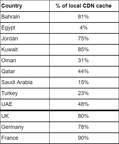
Percentage of traffic going to local datacenters of Cloudflare CDN
As we can see in the charts above, the latencies for countries which do not have local caches are more than twice as slow as countries with a high percentage of cache access. The reason being that users with no local cache access are sent to EU-based datacenters. This is an unfortunate situation in the region as it has a big impact on the user experience. In other regions such as the EU the lack of local CDN cache does not pose a big impact on the user experience as the users who do not have access to local cache can be routed efficiently to neighbouring countries which are geographically not very far and therefore the latency impact is minimal.
Conclusion
The situation in the region has improved considerably since 2019 and it is the new data centers and the partnerships with carriers and operators that have enabled this for the users. The biggest gains were observed with AWS and Azure datacenters which will push more local companies to host with those platforms and enable consumers to have an improved user experience.
Microsoft Azure and Amazon AWS Launched new data centres in the summer of 2019
First Microsoft Azure and then, soon after, Amazon AWS launched new data centres in the Middle East. Azure launched in United Arab Emirates in June and AWS launched in Bahrain in July. In this report we examine the latencies achieved to these servers and compare them to existing options such as hosting in EU or using CDNs with presence in the Middle East. We compare latencies from 13 countries in the Middle East and identify the winners and losers.
Microsoft and Amazon are not short of ambition. Here is how Sayed Hashish, Regional General Manager, Microsoft Gulf described the new regions:
“These new cloud regions in the UAE are the dawn of a new era, driving digital transformation, economic growth and job creation.”
In this report we show which countries should switch to the new data centres if latency and network performance is important and, just as important, which countries should stay where they are (at least for the time being).
SpeedChecker Measurement Methodology
SpeedChecker analysed measurements collected from over 50,000 latency tests taken during business hours for one day in August 2019. This is how the samples were collected:
From both cellular and fixed connections
The distribution of samples between cellular and fixed connections were approximately equal except for Iraq and Palestein where there were a bigger proportion of fixed connections.
The same number of samples were taken from each country to each of the CDN providers used in our report to ensure equal comparison
Location of devices determined by geographical information on the device to be within one of the 13 countries in the Middle East as shown in the results
Latency tests results include samples from all MNOs/ISPs used by the users during the sampling period.
We compare latencies of new Azure and AWS regions with established CDN in Middle East – Cloudflare, which offers decent coverage, performance for a reasonable price. We also compare against Digital Ocean Amsterdam datacenter to have a reference point when content is hosted outside the Middle East.
Our tests are designed to accurately measure the latency experienced by the user at the time of test. We further analyse the results to remove any tests that fail our quality control including where there is some anomaly in the result that makes it unreliable.
Results
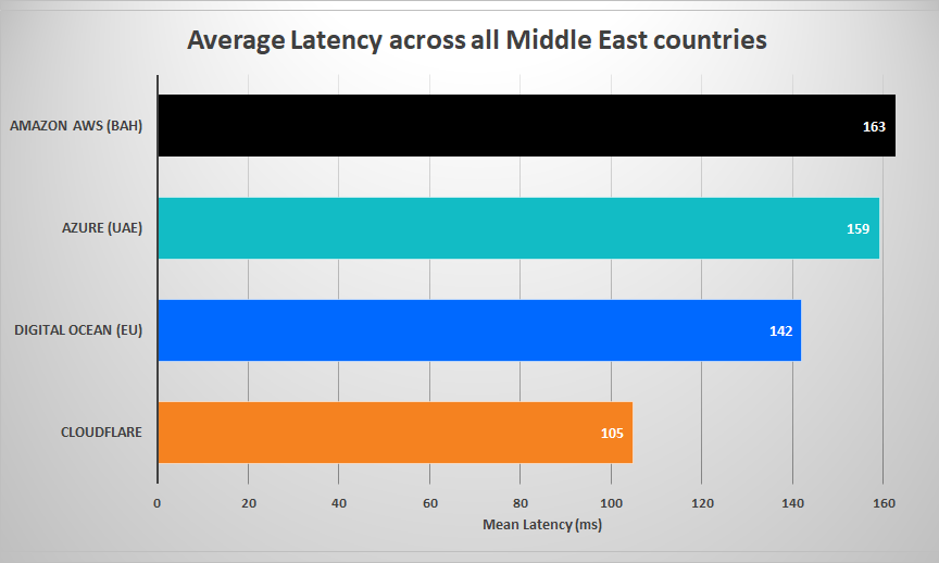
Looking at the mean latency from all our results in the Middle East shows that connections to Cloudflare and Digital Ocean provide the lowest latency. It is to be expected that Cloudflare would do well because they have data centres in all of the countries in our report except for Palestine. The second fastest (Digital Ocean – EU) is some 35% slower than Cloudflare.
It is surprising to see that the Bahrain and UAE servers from Amazon AWS and Azure are both slower than the Digital Ocean EU servers despite being closer geographically. There is not much to choose between them with both of them being less around 15% slower than the Digital Ocean EU servers and some 60% slower than Cloudflare’s local Middle East servers.
The chart below compares the latency from each country to each of the four data centres. Amazon and Azure do best in Bahrain and UAE (their host countries) but there is little difference in the other countries. Cloudflare produce some good results in Bahrain, Turkey and Qatar.
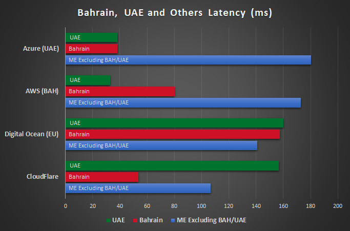
Winners: Bahrain and United Arab Emirates
In this chart we compare latencies to the data centres from the United Arab Emirates, Bahrain and other countries (excluding UAE and Bahrain). Not surprisingly we see that UAE and Bahrain get the best results from Azure and AWS data centres located in their countries. What is striking is that UAE gets a very similar performance from the AWS server in Bahrain as it does from its local Azure server.
Bahrain also does well when using Cloudflare servers but below the average of other countries when using Digital Ocean. UAE have slower results than average to both Digital Ocean and Cloudflare data centres making the introduction of local data centres all the more important.
We also see that other countries gain little from the new data centres with average latency being slower to AWS and Azure than to Cloudflare or even the Digital Ocean EU data centres.
Conclusion
If latency and network performance is critical for your business in the Middle East, you have to carefully decide which cloud to choose. As indicated in this post there are some staggering differences between latencies to Azure and AWS clouds depending on the countries your users are from. If your business caters to Bahrain or UAE, you cannot go wrong by picking any of the two platforms. However, if you expect decent latencies across the whole Middle East, you should consider using CDNs such as Cloudflare or Akamai which have a good footprint in the region with good connections across the majority of the countries.
The new AWS and Azure data centres are still, unfortunately, not well connected beyond Bahrain and UAE and, as you can see from our data, the latencies are similar to those you would expect by hosting your content in Europe. This could well change and perhaps quite soon and we will continue to monitor performance and report on any improvements.
Hajj 2019: 2.5 Million Visitors Puts a Huge Demand on MNOs
Saudi Arabia has confirmed that nearly 2.5 million pilgrims performed the major Islamic pilgrimage to the holy city of Mecca this year. This puts a strain on the city’s infrastructure and we have looked at how the MNOs coped with the increased demand for Internet access and compared the results with 2018.
We compare the download and upload speeds of the STC, Mobily and Zain on cellular networks between 8th and 15th August 2019 with each other and with their performance in 2018.
For Hajj last year (2018) the King Salman bin Abdulaziz and Crown Prince Mohammed bin Salman issued a directive “to do everything possible to make it easy for pilgrims to perform the rituals of Hajj”. The initiative’s objective was to allow pilgrims to communicate with their families and enable them to access the digital services available in the Smart Hajj initiative. This was a great success as seen in our report from last year. In this report we see that this has continued for 2019 and look forward to 2020.
Speedchecker Measurement Methodology
We analysed cellular data collected from over 50,000 speed tests taken between 8th and 15th August 2019. This data was restricted to include only data that was:
Within the city of Mecca
Cellular only (not fixed)
Provided via the top 3 MNOs operating in Mecca (STC, Mobily and Zain)
Our speed tests are designed to accurately measure the speed experienced by the user at the time of test. We further analyse the results to remove any tests that fail our quality control including where there is some anomaly in the result that makes it unreliable.
We chose to limit to cellular because this is the type of connection most likely to be used by visitors as well as local residents and therefore more likely to be impacted by the surge in demand during Hajj.
The top 3 MNOs (STC, Mobily and Zain) were chosen because they account for almost all connections in Mecca.
Data Collection
Speedchecker collected the data used in this report using the crowd sourced data samples collected in the field on mobile devices. During the time the data collection took place, Speedchecker received over 80,000 data samples and the included statistics and analysis are based on this dataset.
It was important for us to not only measure the real speeds as experienced by the user but also to ensure that we measured to the same points to ensure a fair comparison. For this we included only measurements to servers in Europe. Read the following section “Choice of measurement server” for more about this method.
Choice of measurement server
Every measurement methodology differs in the selection of measured server infrastructure. Some methodologies focus on on-net servers hosted in telecom premises and others focus off-net. Speedchecker believes off-net servers’ measurements are representing real user experience better than on-net as most of the content accessible by end users lies off-net. Most of the content these days is hosted on CDN networks and the best way to measure most relevant download metrics is to choose popular CDN networks. However, as we learned in our March 2019 Middle East Speed Rank report, not all ISPs and MNOs connect to CDNs directly (or peer) and that has major implications on performance.
Our analysis in March shows that 68% of results from Saudi Arabia were routed via European servers. The results in this report are therefore based on results using European servers to ensure meaningful comparisons. We found no significant difference in performance between the MNOs based on which particular EU servers were being used. It is acknowledged that MNOs that use more local servers may achieve faster results (up to 30% faster than EU servers) based on our March 2019 report, giving a potential margin of error of around 10%.
Results
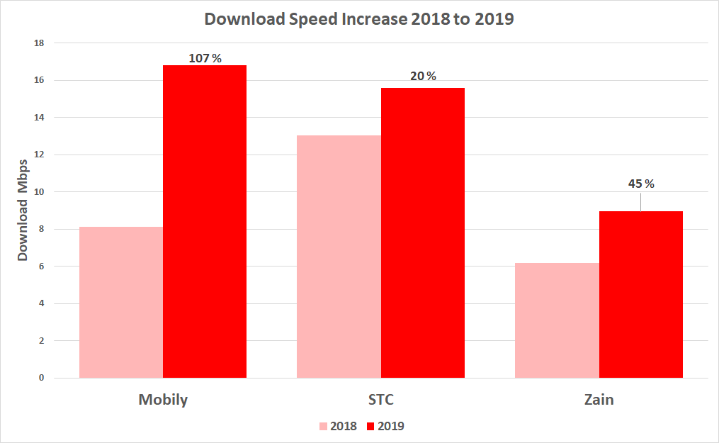
We saw last year that speeds improved not only during Hajj but also that there was a residual benefit that was sustained afterwards. We were curious to see what speeds were achieved 12 months later and found speed improvements of between 20 and 100%.
Download Speed Improvement
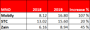
From over 50,000 results we see that there has been an incredible increase in average download speeds of over 70%. Mobily were by far the most improved with their average speed more than double that of Hajj 2018. This gives them an overall average download 1.2 Mbps faster than STC and nearly double that of Zain. Zain should be given credit for a nearly 50% improvement which, in normal circumstances, would have been more noteworthy.
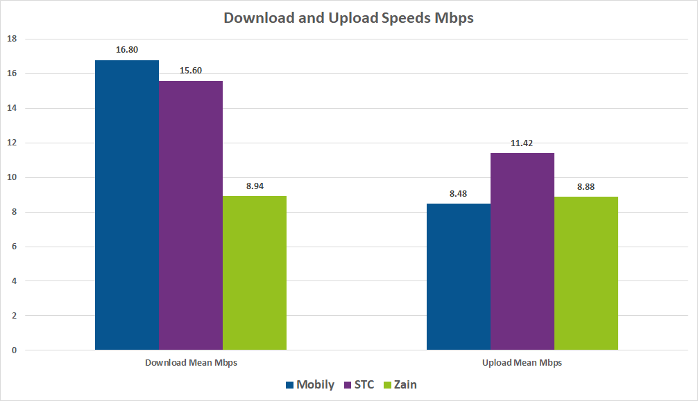
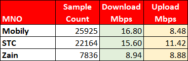
2019 Results for Mobily, STC and Zain
Comparing download and upload speeds across the top 3 MNOs Mobily are faster for downloads and STC are faster for uploads. Zain compares better for upload speeds than it does for downloads.
Conclusion
There is good news for all customers with all three MNOs out-performing their 2018 results. Clearly Mobily have excelled and I suspect this has been helped by their partnership with Ericsson that started in 2018:
Eng. Ahmed Aboudoma, Mobily Chief Executive Officer, Mobily, says: “This agreement with Ericsson is in line with the Saudi Vision 2030 and its objectives that fall within developing the Telecom and IT sector, in addition to preparing best-provided services to customers that comply with its new strategy ‘RISE.’ This includes a concept that raises the level of provided services to customers by using the latest telecom technologies.” [source: Ericsson]
Mobily have also teamed up with Huawei to upgrade its infrastructure towards 5G. This may not have had time to account for the improvement we have seen in 2019 but should help to deliver more improvement in 2020. STC are also upgrading to 5G with help from Nokia as well as Huawei [source: RCR Wireless ].
Once again, Mecca excels at delivering excellent communications as it copes with the huge demand of Hajj.
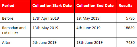
In 2019 7 million visitors arrived in Jeddah during Ramadan (5th May to 3rd June) compared to its normal population of between 4 and 5 million. Google’s own insight report shows that demand increases during Ramadan as well. In this report we examine how the MNOs (Mobile Network Operators) coped with this increased demand. We analyse speeds between 17th April through to the 13th June to compare average download speeds before, during and after Ramadan.
Ramadan, Jeddah and the Internet
Internet Use Peaks During Ramadan
Internet use in MENA (Middle East and North Africa) during Ramadan is higher than any other time of the year. Google internal data shows huge spikes across several content categories on YouTube throughout the holy month each year, including TV & Comedy, Cooking & Recipes, Religion & Spirituality, Gaming, Auto & Vehicles and Internet & Telecom. Here is a chart from Google’s report in 2015 showing demand for TV and comedy downloads rising during Ramadan and falling after Ramadan.
“Ramadan is one of the most active times of the year for social media in the Middle East – on all social media channels – as Muslims reach out to friends and family, prepare for the holy month, and celebrate in the run up to Eid.”
Jeddah Welcomes 7 Million Visitors
The Kingdom of Saudi Arabia issued over 7 million Umrah visas for 2019 and as of May 2019 6,964,943 have arrived in the Kingdom. Most of these will arrive in Jeddah because Jeddah airport is the gateway to the capital of the Kingdom of Saudi Arabia and it is the national air transport center.
Methodology
We analysed data before, during and after Ramadan between 17th April and 5th June. This data was restricted to include only data that was:
Within the city of Jeddah
Cellular only (not fixed)
Provided via the top 3 MNOs operating in Jeddah (STC, Mobily and Zain)
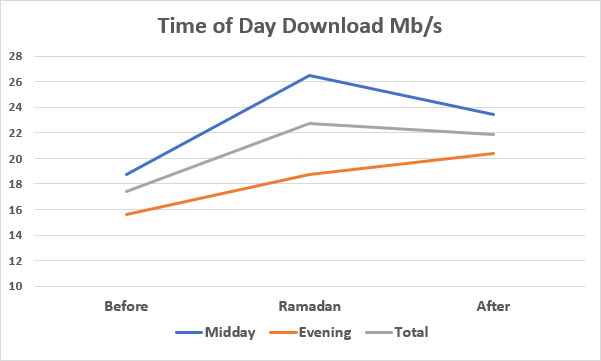
Midday (12 to 2pm) or Evening (8pm to 10pm)
Jeddah was chosen because the number of visitors expected to pass through during this time could be expected to have a significant impact on the service provided by MNOs. We were keen to see how the MNOs coped during this time.
We chose to limit to cellular because this is the type of connection most likely to be used by visitors as well as local residents and therefore more likely to be impacted.
The top 3 MNOs (STC, Mobily and Zain) were chosen because they account for almost all connections in Jeddah.
We chose evening because we anticipated the demand to be high during those hours. Midday was chosen to compare the quality of service during two different parts of the day with different demands on the Internet.
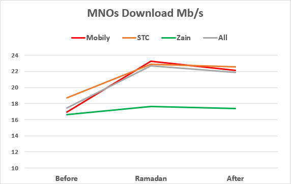
Results
STC and Mobily achieved the best results with nothing to choose between them. Although Zain achieved lower speeds credit is given for sustaining their performance during this spike in demand.
We were also interested to see how performance varied during the day from the quiet of midday to the peak viewing / download time of the evening. Here we see that the speed in the evening was always well below the speeds achieved during the day. Even so, the evening speeds improved by 30% during Ramadan.
For Hajj last year (2018) the King Salman bin Abdulaziz and the Crown Prince Mohammed bin Salman issued a directive “to do everything possible to make it easy for pilgrims to perform the rituals of Hajj”. The initiative’s objective was to allow pilgrims to communicate with their families and enable them to access the digital services available in the Smart Hajj initiative. This was a great access as seen in our report from last year.
Although we didn’t see any similar initiatives being advertised in Jeddah during Ramadan it appears from our results that efforts have been made by MNOs and the Kingdom to sustain performance during this high demand.
Conclusion
We expected to see that as more and more people arrived in or passed through Jeddah during Ramadan that the speeds achieved would fall and then return to previous levels as the demand diminished. However, all three MNOs achieved remarkable results showing an increase in measured speeds during Ramadan compared to the weeks before. Although there was some reduction in speed after Ramadan it seems to have sustained a higher level than before. As discussed previously, the increased demand for Internet was predicted well in advance giving MNOs ample time to prepare. We can only assume that they used this time wisely and their customers (and guests) reaped the benefit.
It is heartening to see that there seems to be a residual benefit to customers of all three MNOs with the speeds after Ramadan being higher than before (if not quite as high as experienced during Ramadan).
The 200,000 festival goers at the 2019 Glastonbury Festival were treated to free 5G via temporary masts installed by EE as it became the UK’s first 5G connected festival. In this report we look at what this meant for the music lovers as they enjoyed the music over 5 days in the English countryside. Did EE customers notice an improvement? How did the other MNOs fare?
Photo of crowds at Glastonbury. 2017 Image courtesy of creative commons. Cropped to fit.
Temporary 5G Network Installed by EE to Serve 200,000 Users
EE (owned by BT) have installed 5 temporary masts across the 900 acre (3.5 square kilometres) festival site to broadcast 5G for the first time. The same masts are also providing 2G, 3G and 4G. They have a free 5G-powered Wi-Fi for the 200,000 festival goers to connect to.
In previous years the demand for mobile data during the festival was huge and this year will be even greater. During the previous festival (2017) 54 terabytes of mobile data was used and it is expected that this year it will be 40% higher at 70 terabytes. Possibly higher if the temporary EE 5G network is successful. Research from EE shows that the typical Glastonbury-goer will “watch 16 different performers and post a minimum of 12 videos on social media documenting their experiences at Worthy Farm – resulting in 2.4 million uploaded throughout the weekend”.
The image below is an example of the temporary masts erected by EE at Glastonbury to provide improved 2G/3G/4G service as well as 5G.
Photo of EE Temporary mast at Glastonbury. Image courtesy of pedroc.co.uk
Methodology
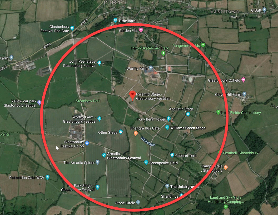
We started collecting data when people started to arrive on Wednesday and continued through to Sunday. We concentrated on results in and around Worthy farm and only analysed cellular results. The only residential area was the small village of Pilton (population < 1000) which means that by restricting our analysis to cellular we can be sure that most of the data came from festival goers.
The image below shows the remoteness of the festival and how challenging it can be to provide a good service. The circle shows an approximation of the geographical area covered by our results.
Aerial view of Glastonbury showing internet data coverage. Image courtesy of Google.
There are many factors that can affect the quality and accuracy of a speed test on a mobile device and we are able to take these into account to grade each result in terms of reliability. For this study we decided to only use the most reliable 2500 taken during the festival.
Results
Our analysis is based on 2500 measurements from 468 unique devices including 145 different models, 23 manufacturers and 4 MNOs taken over the 5 days of the festival. We compare the performance of the MNOs, the devices and also show how performance varied from day to day.
MNOs
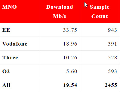
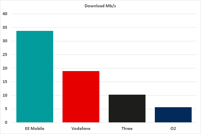
During the festival 4 mobile network operators (MNOs) provided internet to the festival goers with EE, O2 and Three being the most popular. The results show that EE was able to provide nearly twice the average download speed with Vodafone clearly in second place but still very much slower than EE during the festival.
Chart showing Download speeds by MNO
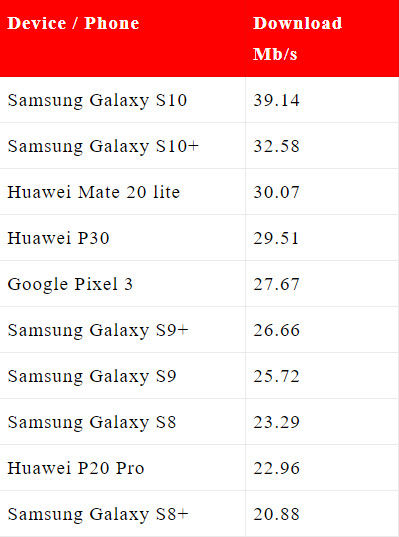
Devices / Phones
During the festival we collected data from 468 unique devices including 145 different models from 23 different manufacturers. Here are the top 10 fastest phones from our data collection during the Glastonbury Festival. The list is dominated by Samsung models 9 and 10 with the S10 being the best by far.
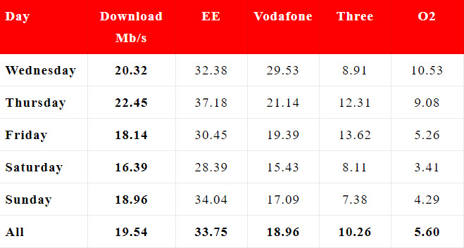
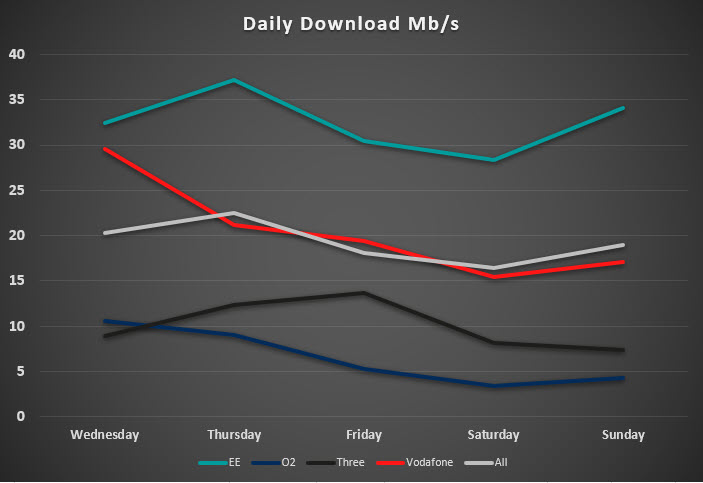
Daily
The speeds were quite good on Wednesday when people started to arrive and the final preparations were being. The best day was Thursday, the first full day of the festival and speeds gradually fell away as more people arrived and as the bigger acts appeared. The bigger the act the more videos being uploaded to the Internet and the higher the demand on the services. EE performed particularly well on the final day being twice as fast as its nearest rival, Vodafone.
Chart showing internet speeds at Glastonbury on each day
Conclusion
Glastonbury festival goers have enjoyed excellent performance whilst enjoying the music in the English countryside with 30% enjoying download speeds in excess of 20 Mb/s. 20 Mb/s is also the average for all customers which is higher than expected and is due to the nearly 35 Mb/s average achieved by EE customers thanks to the provision of temporary masts by EE. Although these masts supported 5G we saw no 5G devices being used in our crowdsourced data sample of 468 unique devices.
Of course the real winner was music but EE must be very happy with their performance throughout the festival.
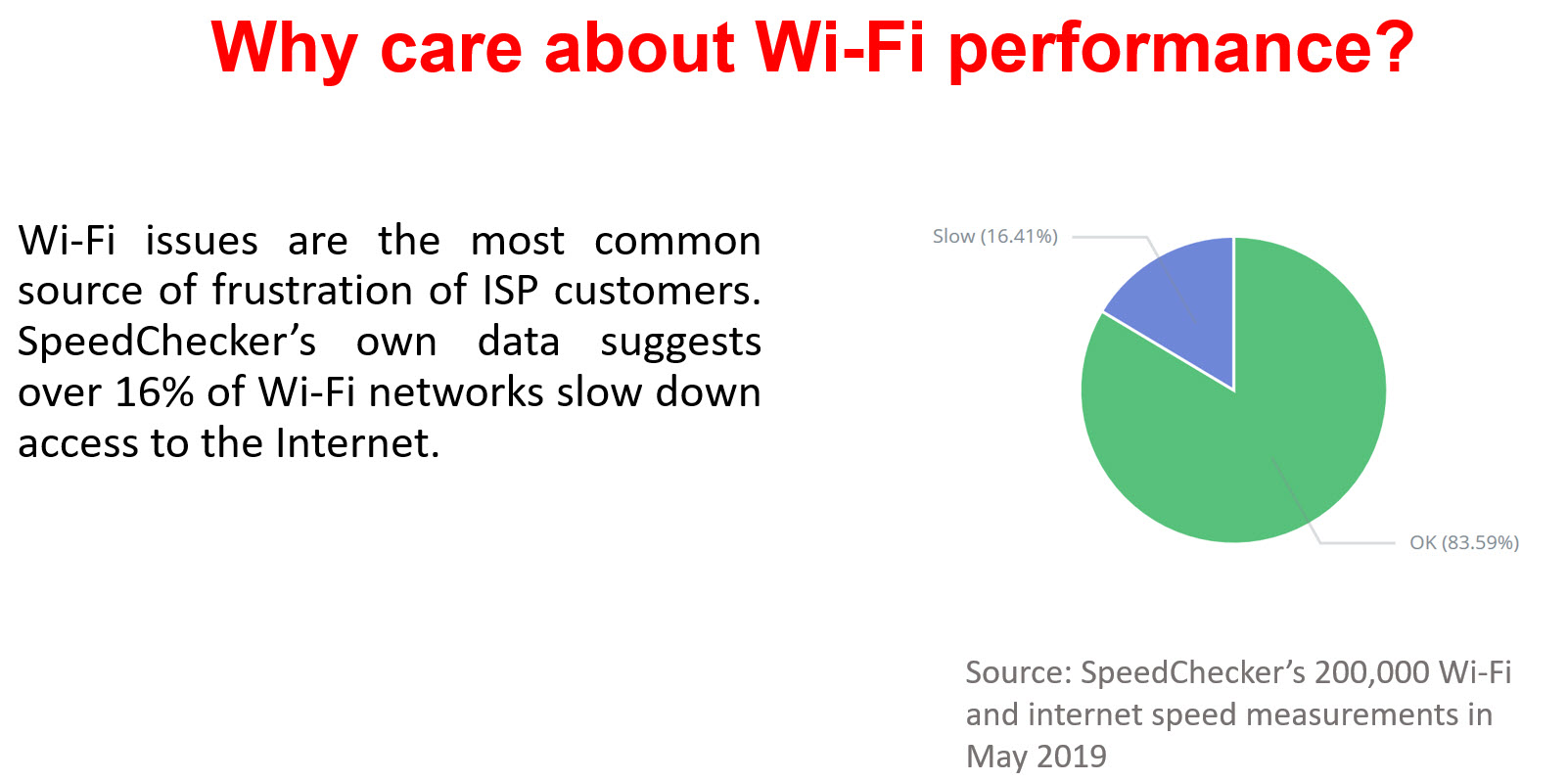
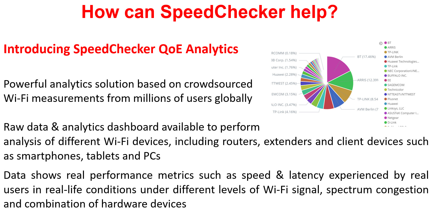
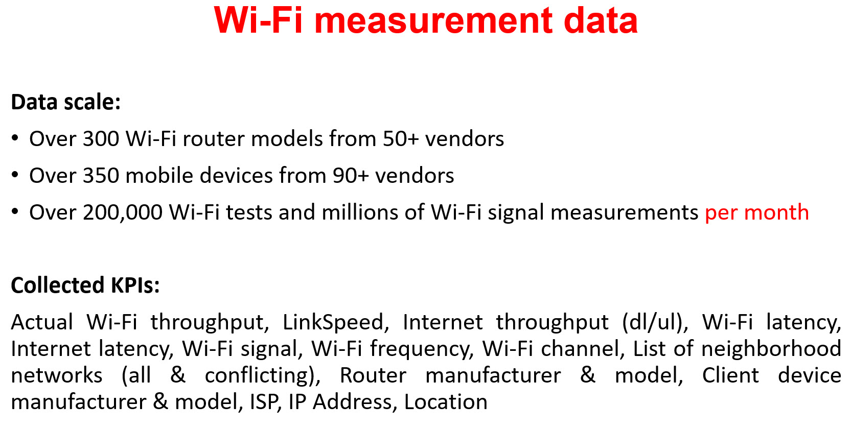
SpeedChecker analysed 300,000 speed test results to produce a Wi-Fi performance ranking of CPE (routers) around the World. Our results show that the choice of router has an important impact on the perceived speed of the Internet even for users of the fastest devices and the with the strongest signals.
In this white paper we explain how our methodology eliminates other causes of slow speeds and presents a ranking table of routers for the top 20 manufactures. We also show the cost of the routers to identify the routers that offer the best value for money. The conclusion of our study show that there are some clear differences between manufacturers and between the models that each provide.
The purpose of this white paper is to rank Customer Premises Equipment (routers) in order of Wi-Fi throughput, to help consumers and providers to diagnose slow internet connections. There is often disagreement between the consumer and the provider regarding where the fault lies for slower than expected Internet connections. There are many causes for a slow internet and this white paper explores the impact of the CPE (router) on the final speed perceived by the consumer.
In this section we explain the methodology used to ensure that we are able to confidently rank routers to identify the fast and slow routers. This will help to diagnose poor speeds because the data will allow the consumer or provider to know what to expect from the routers being used. The methodology is designed to allow for a fair comparison between routers.
This white paper is based on 300,000 speed results collected between 1st April and 10th June 2019.
We analysed these 300K results and filtered them to eliminate other factors that could be reducing the speed of the CPE. We eliminated any speed tests that failed our rigorous accuracy check, any tests that used devices not capable of the fastest speeds and any tests that had a poor signal quality. We also disregarded very strong signals that may not have been representative of the average user. Finally, we disregarded any model of testing device or router that had a small data sample. From the 300K we found 46K that met our criteria.
Because of the filtering, we have reduced the CPE models to the most popular ones used by the users. A more comprehensive study ranking a wider set of CPE models will be published in the future.
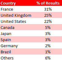
Countries
Our data set includes results from over 100 countries however the vast majority of results are from France, the United Kingdom and the United States.
Client Devices
During the time that SpeedChecker collected results there were over 600 different client device models used (mobile phones & tablets). To ensure that the devices themselves were not the cause of a slow connection we removed results from slow devices, those with insufficient results and those that were not using the 2.4 GHz band.
We removed devices that had a maximum link speed of less than 100 Mb/s and an average throughput of less than 30 Mb/s.
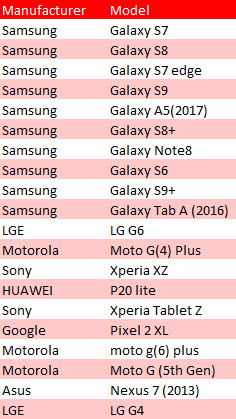
There were 75 devices that met our criteria to be included in the analysis of the CPEs (routers). These are all Android devices because data from iOS devices was not available for this study. SpeedChecker plan to include iOS devices in future studies.
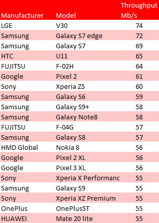
The most popular fast devices in order of results per device:
Samsung are clearly the most popular device but how do they compare in terms of throughput? The following table shows the average throughput in Mb/s for the top devices. Samsung have 5 of the top 10 but the fastest in our sample was the LGE V30.
CPE (Routers)
There were over 400 routers in our sample of 300,000. After eliminating the results from the devices as previously described there still remained over 360. However, for many of these routers there were too few samples to be statistically sound. Removing these left 78 routers that we could analyse with confidence.
The Wi-Fi Throughput Test shows the average maximum measured transfer speed between the device and the CPE (router) using the UDP protocol. Wi-Fi throughput will normally be higher than or equal to the Internet speed.
Internet Download Test
The Internet Download Test is the actual Internet speed experienced on the device during the SpeedChecker speed test using TCP protocol. Our test uses sophisticated procedures to ensure that the result is as accurate as possible.
How SpeedChecker calculate a slow Wi-Fi connection
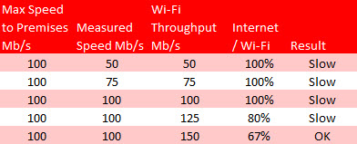
In order to determine if a particular result shows that the CPE (router) was responsible for a slow internet experience, SpeedChecker compared the measured Wi-Fi throughput with the Internet Speed test. SpeedChecker looked at the Internet Speed as a % of the Wi-Fi Throughput. Any result that shows an Internet speed greater than 80% of the Wi-Fi Throughput speed indicates a slow CPE (router).
The following table assumes that a customer is being provided with a 100 Mb/s Internet connection and compares how a slow CPE impacts on the speed they actually experience. If the throughput is slower than the Internet being provided to the premises then the actual speed being experienced is limited to that throughput speed.
In the worst case we see that, although there is 100 Mb/s coming into the premises, the Wi-Fi throughput of the CPE is only 50 Mb/s. A better throughput of 150 Mb/s gives the customer the full 100 Mb/s that is being provided with a ratio of 67%. For our analysis we consider any speed test result that has a throughput speed between 80-100% of the measured Internet speed to be slow. In our ranking tables we include the % of slow results for comparison.
Drawbacks of our methodology:
Our results rely on the CPE (router) having UPnP enabled on the router. Although many routers have it turned on by default there are still a significant number of popular routers that will not appear in our list because UPnP is disabled by default on them. Some users may enable it on these but if there are not enough results to be statistically significant they will not appear in our tables.
Our methodology mitigates against the impact of the wifi setup such as poor Wi-Fi signal and slow/old devices by only including results with strong signals and those results from devices capable of faster speeds. We also mitigate against local impacts on the results during the test itself by eliminating poor results.
The steps that we have taken to ensure accurate ranking of CPEs means that the 300K raw results have been reduced to 50K high quality results to ensure a fair comparison.
How SpeedChecker Filter the Data to Produce Meaningful Results
The purpose of this report is to provide an analysis of the speed results to show the best routers in terms of Wi-Fi Throughput. This will allow comparison of routers (CPEs) and help to identify if the router is causing a poor internet performance.
It was important for us to ensure that we only used speed results that provide information that was reliable, significant and relevant to most users. To do this we filtered our results based on :
Reliability
Device Speeds
Router popularity
Wi-Fi Signal
Wi-Fi Type
Number of results per router and device
Reliability
SpeedChecker take great care to ensure that any speed test result that we use is reliable and accurate. The results that are eliminated include incomplete tests, tests with too few samples and tests that take too long to complete. This can be caused by local interference such as the user moving during the test, the user cancelling before completion and interference during the test by other devices or other apps.
Device Speed
Because we are interested in the performance of the CPE we have included only phones and devices that are capable of the faster speeds. Otherwise, it would not be clear if it was the router or the device that was causing the slowness.
We used the top 75 devices from over 600 devices in the raw data. These all had maximum link speeds of at least 100 Mb/s and we had sufficient results from each device to be statistically significant. To qualify for this list a device was also required to have a minimum of 250 results.
The average Wi-Fi Throughput for these devices ranged from 30 to over 100 Mb/s.
Router Popularity
We list the most popular routers based on the number of data samples for each router and their popularity in Europe. It should be noted that some of these routers are offered as ISP brands. A router needs to have sufficient results to allow for statistically sound analysis.
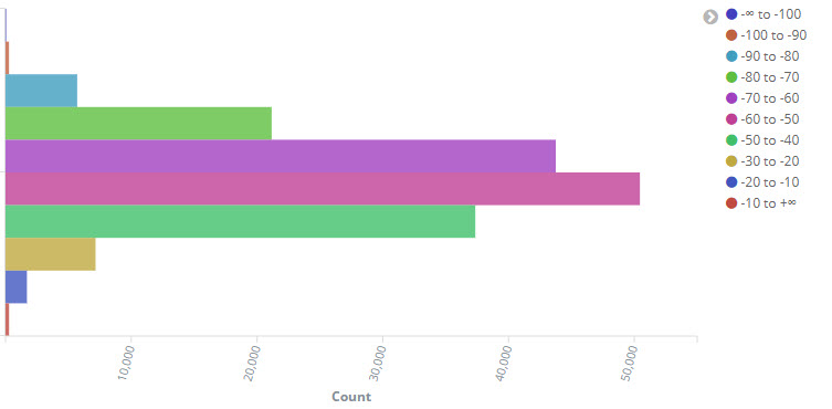
Wi-Fi Signal
A weak Wi-Fi signal will also produce slow results and would cause a router to be mis-reported as being slow. We looked at the number of results in each band of signal strength and, as seen in the chart, we saw that most of them were between -40 and -70 dBm. We filtered out any results worse than -70 dBm. We also filtered out strong signals (above -40dBm) to ensure that our analysis focuses on the more challenging wireless conditions where users typically struggle with wi-fi, and ideal conditions where most of the CPEs are working well.
Distribution of Results by Signal Strength (dBm)
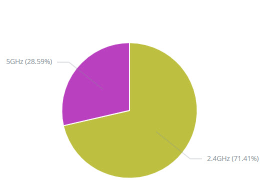
Wi-Fi Type (2.4 GHz or 5 GHz)
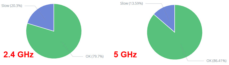
Our analysis restricts results to those using the 2.4 GHz band to make the comparison equal across all routers. We chose 2.4 Ghz because our results show that there are twice as many users of 2.4 GHz than 5 GHz meaning that most users will be using the 2.4 GHz band. We also see that there are 50% more slow results for 2.4 GHz compared to 5 GHz.
Distribution of 2.4 Ghz and 5 GHz bandsPercentage of slow results for 2.4 and 5 Ghz
Number of results per router and device
Another filter that we apply to our results is to ensure a minimum number of results per device and per router. The restriction on the device (phone / tablet) was used in identifying the devices to be used to filter the CPE (router) results. These results were then further reduced if a router had insufficient measurements from these faster devices.
CPE Manufacturer Ranking
For the top 20 manufacturers the following table ranks the best CPE from each manufacturer in order of average Wi-Fi Throughput. We also give the average Internet Download speeds as measured by our speed test. The Slow % indicates the % of results for that router that were defined as slow by the metric discussed previously. We provide the cost where available to allow for a Value For Money comparison.
We provide further tables that include their other top-performing equipment in the section that follows.
[supsystic-tables id=1]
Ranking table of best models for each CPE manufacturer
Prices are given for CPEs that were available to buy at the time of writing and are in USD.
The Internet speed as measured by our Speed Test is provided to give an indication of the speeds expected by the consumer with most speeds between 20 and 50 Mb/s. A couple are much lower than that, particularly TP-Link Archer_C5. This should not be interpreted as a fault of the router especially in this instance where the slow % is only 2%. i.e. the router is not the cause of the slow internet speed. Most likely the slow internet speeds are linked to the actual router being popular in countries / ISPs which offer internet packages with low speeds.
Vendor-specific CPE Ranking Tables
The previous table ranks all manufacturers by their best-performing CPE (routers). In the following tables we take the top 10 manufacturers and include the overall ranking position.
There are no tables for Compal Broadband or Sercomm because they each have only one CPE in our results.
Arris CPE Ranking
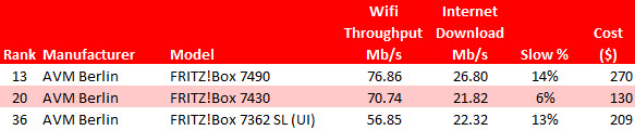
AVM Berlin CPE Ranking
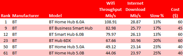
BT CPE Ranking
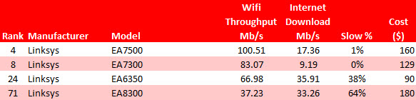
LinkSys CPE Ranking
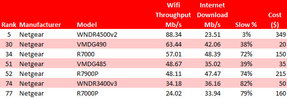
Netgear CPE Ranking
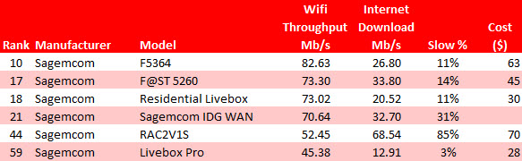
Sagemcom CPE Ranking
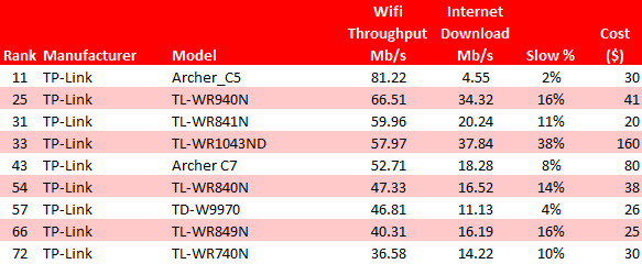
TP-Link CPE Ranking
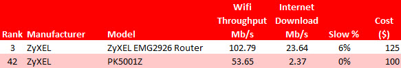
ZyXel CPE Ranking
Conclusion
The results of our study show that there are some clear differences between manufacturers and between the models that each provide. Most manufacturers provide one or two routers that are significantly better than the rest, reflecting improvement in technology. For example, BT is releasing new versions of its models and we can see clearly from our data the wi-fi throughput increases with every version and showing it is worthwhile upgrading.
Although more connections are being made using the 5 GHz band than previous years, 2.4 GHz connections are still used twice as often. It is interesting to see that the percentage of slow connections using 2.4 GHz (20%) is 50% larger than for 5 GHz (13%). We conclude that most customers suffering with slow connections are still using 2.4 GHz and that is why we concentrated on this band. The reasons for this include the CPE (router) not having a 5 GHz band, the user not switching to 5 GHz either because of lack of knowledge or because they get better results on 2.4 GHz (because of distance, walls etc).
Routers from BT, Sercomm, Zyxel and Linksys topped the ranking in terms of Wi-Fi throughput, each being 10% faster than their rivals. The Linksys EA7500 and ZyXel EMG2926 were particularly impressive because their slow % was 1% and 6% respectively. Sercomm’s top router (the Livebox) had a faster throughput but a disappointing 19% slow %. If reliable performance is important then choose the Zyxel or Linksys router but if value for money is important then choose BT Home Hub 6 or Sercomm Livebox, each costing less than half of the others. The AVM Berlin Fritz!Box 7490 at $270 does not offer the best VFM, however, their second router (7430) at $110 is a better buy.
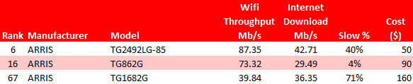
Only one manufacturer in the top 10 had a slow % below the average: the Arris TG2492LG-85 at a disappointing 40%. With a throughput of 87 Mb/s it performed well but if reliability is important then choosing their second fastest (TG862G) gives a respectable 73 Mb/s but only 4 % slow %.
Most manufacturers have some routers that have a wide range of slow %. BT is unusual in that the 6 routers in their table range between 13% and 20% with the throughput correlating with the slow % i.e. the faster the throughput the small the slow %. Netgear in contrast has a flagship router (WNDR4500v2) with great throughput and negligible slowness but 6 others that perform poorly in contrast. Linksys have two great routers and two not so great.
In this analysis of speed test results taken in countries in the Middle East during February 2019 we compare download speeds between countries, between MNOs & ISPs within each country and also compare how performance varies across different subsidiaries of the major Telecom Groups.
Key Insights
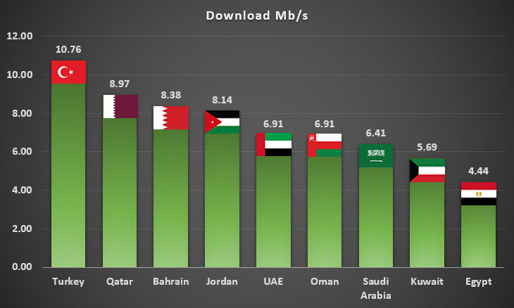
Middle East average download speed: 7.3 Mb/s
Turkey, Qatar, Bahrain and Jordan have above average download speeds
Egypt and Kuwait have the slowest download speeds
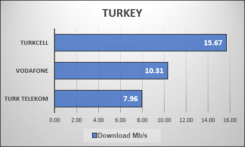
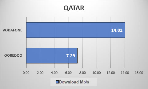
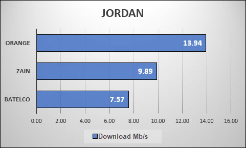
Vodafone in Qatar, Orange in Jordan and Vodafone Turkey are the fastest amongst MNOs & ISPs with download speeds over 10 Mb/s
Inconsistent CDN peering impacts user experience
Country Ranking
Regional average download speed is 7.3 Mb/s.
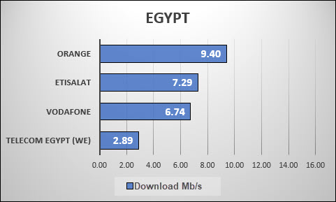
Turkey (10.7 Mb/s), Qatar (9.0 Mb/s), Bahrain (8.4 Mb/s) and Jordan (8.1 Mb/s) top the chart with above Middle East average download speeds. Egypt (4.4 Mb/s) and Kuwait (5.7 Mb/s) have the poorest performance in our tests. These speeds are represented in the following chart.
How Telecom Groups Perform in Different Countries
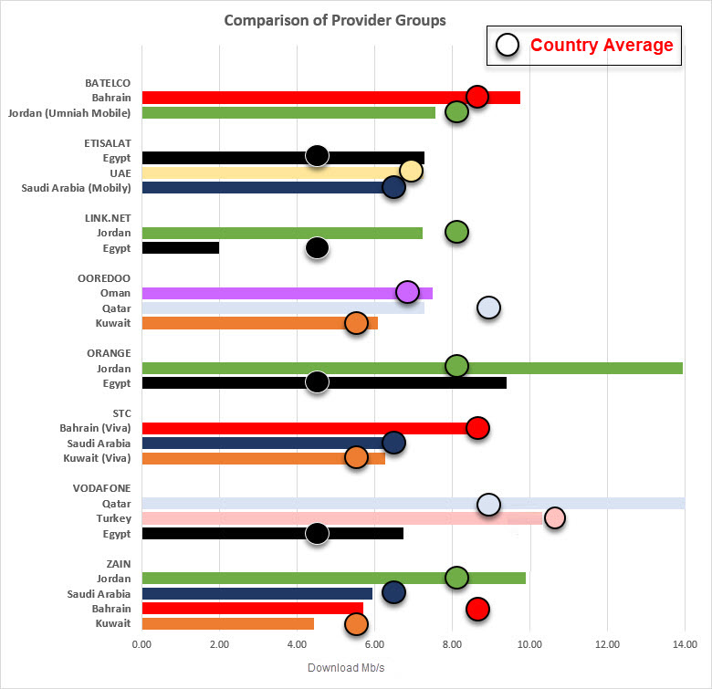
There are a number of international MNOs & ISPs that offer services in more than one Middle East country:
Telecom Group
Number of
Countries
Countries
Batelco
2
Bahrain and Jordan
Etisalat
3
Egypt, Saudi Arabia and United Arab Emirates
Link.Net
2
Egypt and Jordan
Ooredoo
3
Kuwait, Oman and Qatar
Orange
2
Egypt and Jordan
STC / Viva
3
Bahrain, Kuwait and Saudi Arabia
Vodafone
3
Egypt, Qatar and Turkey
Zain
4
Bahrain, Jordan, Kuwait and Saudi Arabia
Our next chart superimposes the average speed for each country with the speeds for each Telecom Group so that we can see which Groups produce above or below average in each country that they operate in. Each country is given a unique colour in the following chart to allow a visual comparison of speeds for different Telecom Groups in each country.
Most Telecom Groups outperform the average in each country with the following exceptions:
Batelco in Jordan
Link.net in Jordan and Egypt
Ooredoo in Qatar
Vodafone in Turkey
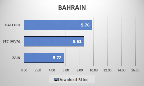
Zain in Saudi Arabia, Bahrain and Kuwait
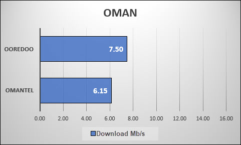
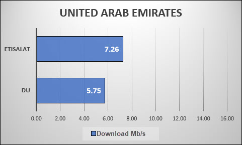
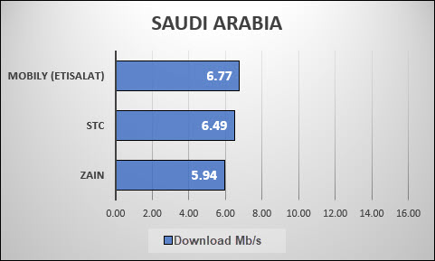
Top MNOs & ISPs in each Country
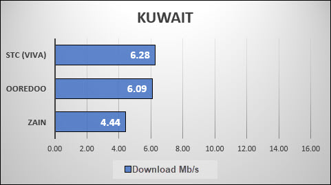
In this section we look at how the most popular MNOs & ISPs perform in each country. The charts are in order of the fastest available download speeds with a consistent scale of up to 16 Mb/s to make comparison easier.
SpeedChecker Measurement Methodology
Data Collection
SpeedChecker collected data in all countries during the same period in February 2019 to ensure a fair comparison. We gathered many data points using the crowd sourced data samples collected in the field on mobile devices. During the time the data collection took place, SpeedChecker received over 60,000 data samples and the included statistics and analysis are based on this dataset.
It was important for us to not only measure the real speeds as experienced by the user but also to ensure that we measured to the same point to ensure a fair comparison. For this we included only measurements to one server in Amsterdam. Read the following section “Choice of measurement server” for more about this method.
Choice of measurement server
Every measurement methodology differs in the selection of measured server infrastructure. Some methodologies focus on on-net servers hosted in telecom premises and others focus off-net. SpeedChecker believes off-net servers’ measurements are representing real user experience better than on-net as most of the content accessible by end users lies off-net. Most of the content these days is hosted on CDN networks and the best way to measure most relevant download metrics is to choose popular CDN networks. However, as we learn in this report, not all ISPs and MNOs connect to CDNs directly (or peer) and that has major implications on performance.
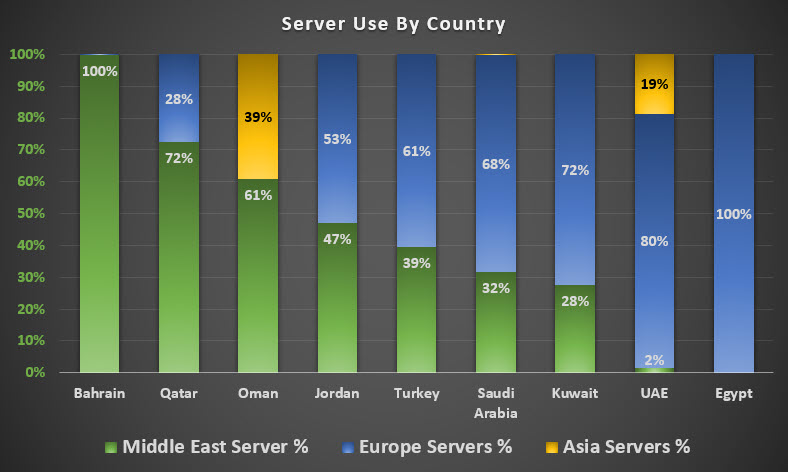
One of the main advantages of CDN peering is to improve connection time and download speeds by bringing the content closer to the end user. Before we could analyse the speed results, we considered how widespread peering was and discovered that there was a variation between 0 and 100% use of local servers.
The chart above shows the percentage of results from each country that are routed via local Middle East Servers, Europe or Asia. Bahrain, Qatar and Oman are all above 50% Middle East server use with Bahrain at 100%. United Arab Emirates and Egypt have a very low use of local servers. In our case we have used the most popular CDN – Cloudflare.
Speeds achieved to local servers were, on average, around 30% faster than speeds routed via European servers but this is not available to the majority of users. Because of the unbalanced availability of this CDN peering we chose to limit our analysis to results from one particular server based in Amsterdam, Europe.
No country will have an unfair advantage as would be the case if local servers were used
The majority of content is still hosted in Europe which means the download speeds reflect actual usage for most of the content downloaded by the end user
It is acknowledged that the operators in some countries that are peering with CDNs will achieve better results than those shown in this report.
 nding might reach $5.7B this year alone, by 2027 it should reach an estimated $9.8B